What I reckon...
I'm gonna go with ems.
Why?
Because as far as users go, everyone is different... and legibility is completely subjective.
If someone has gone to the trouble of creating or having a website created, they've obviously got something to say. That means words are vitally important & there is nothing more disappointing & frustrating to a user than crucial text not being legible.
Lets not forget, there's old folks out there that can't see what's on their dinner plate let alone what some designer has fixed at a squintworthy sizing for the sake of aesthetics.
Sure, people appreciate cool design, but it has to be subservient to content & usability and let it complement not distract from content.
So I reckon, make your font size a em / percentage.. and ensure your user can appreciate your design at same time as get what they've come for in the first place...
Tuesday, August 10, 2010
Monday, August 9, 2010

Monday, August 2, 2010
Foxtel flash banner
I created this last semester & am pretty happy with it.. though the Alice in Wonderland references aren't quite as 'of the moment' as they were back then. I think I will redesign the arrow at the end - it just looks a little scrappy.
Thursday, July 22, 2010
Uncanny Resemblance
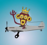
Wow.. I just realised how much my monkey in logo looks like Tony bloody Abbott... That's quite disturbing! Hopefully no one will remember who he is in the not-too-distant future..
Monday, July 19, 2010
My Logo!
Here's my logo for Heaps Good Design..

It is a carry-over from last semester & I look forward to working on it a bit more & animating it soon.
It is a carry-over from last semester & I look forward to working on it a bit more & animating it soon.
Check Magazine - homepage redesign
My redesign of the Check Magazine homepage:

Design feedback from Elizabeth:
Need to:

Design feedback from Elizabeth:
- likes black seperator bars - noted how they compliment the models belt & tie
- likes the typography used - works well with fashion & lifestyle magazine
- complimented the text box in main image & gradient used - clean & classy
- commented on good use of colour - repetition of balck & whites as well as red & yellow
Need to:
- links need to be added to text paragraphs
- the plus symbol needs to be added adjacent to main image text box
- consider overall size of homepage - make sure its acceptable
Thursday, June 17, 2010
Creating Client Website... 3rd draft of webpage
Ok .. the blog entries may be a little out of order..
You should have a view of my classmate feedback of my 2nd draft webpage design. Overall they thought it was visually appealing and captured the spirit of my client's company well. I did get some very useful feedback about the white content boxes feling a little to harsh and not blending into the design enough.
Below is my further update in light of that feedback..

I also like the hand now holding the whole webpage - kind of cheeky play on the navbar and also reinforces the home/ community made aspect which is at the heart of the company.
I've shown the design to Naomi and she's stoked with it.. reckons it has really come together!
I've created a few little Flash animations too that are tricky to show you here..
Well it's time now for me to start working from this base and creating the other webpages.
I'm so glad Naomi really likes what we have come up with together - I say together because it definitely feels like it has been a very collaborative process.. It's been up to me to actually make the visuals but what they consist of has been an ongoing organic process as we've bounced ideas off each other. It's been an opportune way to work and I know not all clients will want to work with such regular spontaneous contact but that's suited Naomi. Regardless, I have definitely learned that listening hard, reading for deeper meaning, being perceptive and identifying motifs that visually convey the emotions of the clients company and the work they do has been invaluable in coming up with a design the client is really happy with - I'm sure that would go for any client!
Well that's enoght for now.. I've got a heap of work to do so see you in a bit as I roll up the sleeves and churn it out!
Creating Client Website... 2nd draft webpage layout
and here's the update..
Taking into account all the things Naomi fed back to me.. here is my 2nd draft of the webpage design.
This is the one I will be presenting in class tomorrow..

As you can see: a blue background, redesigned logo & almost completed navbar (oops just realised I forgot to change BIOS to TEAM - doh!)..
Next post will be when I show it in class for peer feedback!
Creating Client Website... 1st webpage mockup
Here's some detail of my 1st webpage mock up highlighting logo, navbar & background colour..

Naomi's verdict -
Navbar: really really loves the navbar.. thinks it captures the comapny really well... just told me when adding further buttons & people - try to get a good diversity of cultures in there if possible. Also we both decided the term TEAM would be better than BIOS (biographies of company staff).
Logo: likes colours, themes - just reckons the characters look a little too close to golliwogs and that's not too good for a company that works with Indigenous people! I told her it wasn't intentional - I was tryig to go for simplicity & that they were meant to be silhouettes... It's mainly due to my limitations as an illustrator to be able to create simplistic detail but I will definitely have another crack at it for sure!
Background colour - since mocking this up - I've been thinking how much the background would be better opting for a shade of blue... Naomi was keen on eathern tones like deep red soil, but I reckon I've managed to get that tone in there in alot of graphic stuff I came up with and that we really need a background that is goin to make that visual content stand out... Naomi completely agreed and all is going really well I feel.
Creating Client Website.. Graphic Elements & Logo
Naomi sounded pretty pleased with my visual ideas & I thought it would be great to get these properly mocked up in Illustrator so I can include them in proposal & also .. I really need some visual materials to help me be able to create the visual design for the website!!
Here's a few more sketches..
 And now it's time to reveal some of my hard toil in Illustrator..
Below is a complete page from the proposal showing off the logo design and a motherload of other graphic elements - based on ongoing discussions with Naomi about what needs to be in the website and what it should look like. Check this out...

Here's a few more sketches..

Below is a complete page from the proposal showing off the logo design and a motherload of other graphic elements - based on ongoing discussions with Naomi about what needs to be in the website and what it should look like. Check this out...
Creating Client Website ... Proposal..
Been working on the proposal and the words are flowing nicely and I'm feeling like I've got a good understanding of what this website needs to be and how the client<>designer relationship is gonna work.
The one thing that's freaking me out a little is the amount of work that is needed to get all the content together for the site - so I been very busy at it on the side working up some graphic stuff in Illustrator and sifting through the few discs of images Naomi gave me of her past work as well as trawling through Google for appropriate images. Of course copyright is an issue on both fronts but I am thinking that I will try to deliberately create some anonyminity in the images of people I use but utilising software effects - and I don't mean harshly pixilate peoples face like they were criminals - more of a stylistic use of tools to create a slightly more animated feel which helps conjure up the 'art' side of the brief..
Anyway here's some excerpts from the proposal:
Introduction:
Two Thumbs Up is a newly established Community Cultural Development
company that is preparing to launch itself into the South East Queensland /
Northern New South Wales community arts project market in coming months.
The company has engaged Heaps Good Design to help create its web
presence and corporate identity.
Two Thumbs Up are a dynamic community oriented company that utilise
the arts - predominantly the performing arts - to engage deeply with diverse
communities to create inclusive, multifaceted, placed-based creative
projects that use the arts to bring individual community members from a
diversity of cultures & backgrounds together with local service providers and
government agencies, to together explore community notions of history,
culture & identity, along with critical local issues & together forge a roadmap
to positive change.
Two Thumbs Up are project based and their projects have equal aspirations
for both artistic and community development outcomes.
Major funding sources will be local, state & federal government and
philantropic grants. At startup, the company envisages funding will be attained on a project by project basis but they aspire to attract operational as well as project based funding in the medium term.
Two Thumbs Up are seeking to make a very strong impact with their launch,
with a corporate identity that highlights their dynamic, energetic, creative & fun nature, as well as reflect the grass-roots community nature of their projects with inclusiveness and cultural diversity, as well as the gutsy, poignant & powerful nature of the serious side of their work in dealing
with critical issues.
Objectives:
The major objectives of this proposal are to:
Create a corporate identity for Two Thumbs Up that reflects its values,
aspirations, unique personality and core nature of its work.
This includes the creation of:
a corporate logo as well as visual themes, motifs and colour scheme that can be utilised with continuity throughout all forms of identity documents and promotional materials both in print and online.
a website for Two Thumbs Up that utilise these visual themes that help create a high impact and visually exciting launch for the company as well as provide web platform and format that can continue to grow as the company grows.
The website will be styled to suit a diversity of audiences and will reinforce the core business, values and aspirations of the company to explain with clarity, simplicity and in an engaing way what it is the company does and how it does it.
A key objective of the website is to faithfully capture and communicate the
multifaceted identity of the company.
That is, to portray Two Thumbs Up as fun, creative and dynamic, and
producers of high quality, stimulating artistic output, yet at the same time, show the company as a gutsy organisation that engages deeply, that is
experienced in working around difficult issues and does so with sensitivity & respect and broad engagement to high levels of community leadership,
that understands how to affect change and gets results.
Target Audience:
The website will be aimed at quite a diverse array of potential visitors that are likely to have a vastly different motivation for their visit.
The site will target potential funders and key project partners from the government, community, welfare, philanthropic as well as corporate sectors. These visitors will be interested in seeing the professional side of the company - to explain with clarity who Two Thumbs Up are, what they do and how they do it in terms they are used to dealing with. They will be wanting to see that Two Thumbs Up are experienced, professional, dependable, are worth investing in, are good to do business with and get results.
On the other hand, the website is also aimed towards everyday community
members of all ages, cultural backgrounds and often coming from
disadvantaged backgrounds.
These visitors will be checking out the site to see who Two Thumbs Up are
and helping them decide if they would like to get involved in projects.
Obviously then, it is essential that the website appeals to a broad spectrum without saying too little or indeed too much and fail to fulfil the expectations of either.
Theme/Message:
The website will serve as a major tool in the official launch of the company and will therefore play a pivotal role in establishing the company’s credentials & unique niche in the market along with its unique personality. As mentioned previously, the company’s core business spans both artistic and community development aspirations and the website will serve to communicate their emphasis and ability for creating high quality outcomes in both.
Creating Client Website.. Follow up call to client..
Just got off the phone to Naomi ... talked for over an hour! She's loving some of my ideas and it was great to talk some more about company identity and needs of website... I really feel like we are on the same page and there's a great flow to our communications... I'm really looking forward now to getting working on some visuals - actually, tell the truth, I've done already done a few mock up sketches!
I'll post them now, why not?
Here's my idea for nav bar - people holding up sign which are the buttons... From talking with Naomi just before I'm really reassured that 'community' is a massive focus and that we both agree that one great way to portray that visually is images of lots of people - lots of diverse people but it is important for them to be interacting. I reckon my navbar idea begins to capture that.
 While I'm at it.. here's a very primitive mock up of logo too...
 Got the people coming together & the positivity - just need to add the art somehow.
I'll shoot some of my mock ups off to Naomi and then it's time to work up the proposal and get these ideas & plans formalised in writing.
I'll post them now, why not?
Here's my idea for nav bar - people holding up sign which are the buttons... From talking with Naomi just before I'm really reassured that 'community' is a massive focus and that we both agree that one great way to portray that visually is images of lots of people - lots of diverse people but it is important for them to be interacting. I reckon my navbar idea begins to capture that.

I'll shoot some of my mock ups off to Naomi and then it's time to work up the proposal and get these ideas & plans formalised in writing.
Creating Client Website..Part 2.. I slept on it.
Nothing like a good night's sleep to help give some order and clarity around a head full of new information!
So with the questionnaire filled out and now having a good long face to face meeting with Naomi, I'm feeling like I'm starting to get a good grasp on the task at hand.. so I'll summarise it in brief and then paste in some of the text I've started working on for my proposal..
In brief:
The job: basically create the entire corporate identity for an emerging CCD company from the ground up including logo and other visual motifs, diagrams & images for the website that may also be used in print and other promotions. I have started to make a shortlist of required graphics.
Audience: challenging in that webdesign needs to cater to 2 distinct audiences - 1. participants in projects who often come from disadvantaged backgrounds expecting to find evidence of a company that is fun creative, engaging & in-touch with grassroots and 2. potential project funders / partners who deal more in bureacratic / business environments and also looking to be reassured that the company is professional that understands their corporate world & needs and delivers on outcomes.
Company identity: Two Thumbs up prides itself on being fun creative and having a big heart and producing high quality art, but with a dedicated emphasis on grassroots community empowerment delivering strongly upon community outcomes. It equally values it partnerships with individual community participants as it does with its professional project partners & funders. People, communication & connecting, creating something together, sharing, pride, identity, culture, spectacular creative outcomes, diverse individuals working shoulder to shoulder, pride in outcome, bonding, empowerment, hope & positivity...these are some of the words conjured up in reflection.
I'm gonna ring up Naomi this afternoon and tell her where I'm heading to make sure I'm on the right track.... it's all about good communication to make sure you're on the same page!
Company process: it was clear when talking to Naomi the other day that Two Thumbs Up really values its artistic & its community development process and sees it as quite an advanced concept and a unique & valuable marketing point. Naomi handed me the following document (pasted below) to explain this detailed process and assures me that funders & partners will find it fascinating..

I think it deserves a good colourful spruce up to keep with my emerging ideas for the website.
So I will call Naomi soon to share my reflections with her & get her feedback.. then I reckon I should get cracking on the proposal to give to her... and I can't wait to get cracking on some creating some of the visual stuff..
Back in time... The making of my client website. 1st meeting with client.
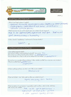
Today was my first face to face meeting with Naomi from Two Thumbs Up. Naomi is a friend of a friend and is on the brink of starting up her own community cultural development (CCD) company and seems very keen to place the promotions of her fledgling company in the hands of a fledgling graphic designer (ie. me!).. I'm excited because CCD (community-based arts & cultural projects) field is definitely an area I know heaps about having worked in it for almost 10 years prior to commencing fulltime studies, so I felt I was able to quickly get a good grasp of where Naomi was coming from and where she'd like to take her new company.
Prior to our meeting, I asked Naomi to fill out a questionnaire to help us both draw focus on what she was wanting out of a website, what it should look like, feel like and what it should contain, as well what in her mind was the optimal way of working together on it.
Check out the scanned questionnaire forms below:


I'm going to need to sit down and have another good read over them & start sketching out some notes & ideas..
But before I go, here's a quick off-the-cuff list of observations about the job:
But for now...goodnight!
Prior to our meeting, I asked Naomi to fill out a questionnaire to help us both draw focus on what she was wanting out of a website, what it should look like, feel like and what it should contain, as well what in her mind was the optimal way of working together on it.
Check out the scanned questionnaire forms below:


I'm going to need to sit down and have another good read over them & start sketching out some notes & ideas..
But before I go, here's a quick off-the-cuff list of observations about the job:
- Two Thumbs Up is a newly formed company that is looking to launch itself into the marketplace - the website will likely be the central feature of this launch (yeah! and yikes!)
- Two Thumbs Up is a brand new company that hasn't created any work of its own yet, so pre-existing materials for website (eg photos, other promo materials etc) are scarce - that means it will most likely be necessary for me to create a number of graphics / illustrations (including a company logo) to supplement written website content on the website.
- From talking with Naomi, the two most unique marketing points that make Two Thumbs Up stand out from the crowd are: 1. the company's personality / unique identity and 2. their unique process (the way they go about their work). Thus the website will have to resonate these 2 key aspects loud & clear.
But for now...goodnight!
Monday, May 24, 2010

Monday, May 10, 2010

Monday, April 12, 2010
Testing Times - the Templates Test
The TEST:
What is a Dreamweaver Template?
A Dreamweaver template is a special kind of document consisting of fixed elements and editable regions that acts as a base from which multiple web documents can be crafted.
What are the advantages of using templates?
Templates save a heap of time as shared elements only have to be set up once and then recalled multiple times. A web designer also benefits from the ability to specify which areas of the document are editable and which are locked so that others such as clients are able to update contents without compromising overall design integrity.
What is an 'editable region'? How do you set it up?
An area designated by the template creator as 'unlocked' in which it is possible to edit the content. A template needs to have at least one editable area - otherwise it's hardly a template! To create an editable region, go insert > template objects > editable region.
What is an 'repeating region'? How do you set it up?
A template region that allows users to add or delete multiple repeats of a particular content element that may possibly be then be editted at will (if you also make it an editable region). For example, multiple catalog items that all have the same layout can be crafted out of a prototype repeating region.To create a repeating region, go insert > template objects > repeating region.
What is an 'optional region'? How do you set it up?
A region of a template document which contains information - could be text or image - which user decides whether or not to include in the published document. ie contents inclusion is optional. To create an optional region, go insert > template objects > optional region.
Monday, February 15, 2010
Goin loco with the logo
~Logo in progress:~~
... lets just say this is very much a work in progress..
(because at the moment it looks like somebody doing a poo or charming a snake)..
Bummer - the animated gif doesn't work on here, but here is the complete jpeg
 - the thumb pops up and the sparks fly.
My off the cuff illustration is pretty dodgy but the working concept is someone giving the 'thumbs up' showing off their unique thumbprint that is being transmitted to the world - the slogan is 'your unique stamp on the world' which as a designer is the service that I offer!
Next step is to create a proper graphic of the hand and thumb - everything rests on this to make me look the business, but I'm happy with the concept... I think it's kind of cheeky and irreverent, which I like and it's where I'd want to position myself in the market.
What do you guys reckon?
... lets just say this is very much a work in progress..
(because at the moment it looks like somebody doing a poo or charming a snake)..
Bummer - the animated gif doesn't work on here, but here is the complete jpeg

My off the cuff illustration is pretty dodgy but the working concept is someone giving the 'thumbs up' showing off their unique thumbprint that is being transmitted to the world - the slogan is 'your unique stamp on the world' which as a designer is the service that I offer!
Next step is to create a proper graphic of the hand and thumb - everything rests on this to make me look the business, but I'm happy with the concept... I think it's kind of cheeky and irreverent, which I like and it's where I'd want to position myself in the market.
What do you guys reckon?
Monday, February 8, 2010
Web Design Criteria
It's important to revisit this & entrench from the very start of the the semester.
Below are the 6 key criteria from the web creation bible - well, the judging criteria from the 'Webby Awards' actually - but these are the 6 undisputable big ones to always keep in mind:
Web Design Criteria
the big 6:
Structure and Navigation
Structure and navigation refers to the framework of a site, the organization of content, the prioritization of information, and the method in which you move through the site. Sites with good structure and navigation are consistent, intuitive and transparent. They allow you to form a mental model of the information provided, where to find things, and what to expect when you click. Good navigation gets you where you want to go quickly and offers easy access to the breadth and depth of the site's content.
Visual Design
Visual design is the appearance of the site. It's more than just a pretty homepage and it doesn't have to be cutting edge or trendy. Good visual design is high quality, appropriate, and relevant for the audience and the message it is supporting. It communicates a visual experience and may even take your breath away.
Functionality
Functionality is the use of technology on the site. Good functionality means the site works well. It loads quickly, has live links, and any new technology used is functional and relevant for the intended audience. The site should work cross-platform and be browser independent. Highly functional sites anticipate the diversity of user requirements from file size, to file format and download speed. The most functional sites also take into consideration those with special access needs. Good functionality makes the experience center stage and the technology invisible.
Interactivity
Interactivity is the way that a site allows you to do something. Good interactivity is more than a rollover or choosing what to click on next; it allows you, as a user, to give and receive. It insists that you participate, not spectate. It's input/output, as in searches, chat rooms, e-commerce and gaming or notification agents, peer-to-peer applications and real-time feedback. It's make your own, distribute your own, or speak your mind so others can see, hear or respond. Interactive elements are what separates the Web from other media. Their inclusion should make it clear that you aren't reading a magazine or watching TV anymore.
Overall Experience
... so there!
the big 6:
- Content
- Structure and Navigation
- Visual Design
- Functionality
- Interactivity
- Overall Experience
Content
Content is the information provided on the site. It is not just text, but music, sound, animation, or video -- anything that communicates a sites body of knowledge. Good content should be engaging, relevant, and appropriate for the audience. You can tell it's been developed for the Web because it's clear and concise and it works in the medium. Good content takes a stand. It has a voice, a point of view. It may be informative, useful, or funny but it always leaves you wanting more.Structure and navigation refers to the framework of a site, the organization of content, the prioritization of information, and the method in which you move through the site. Sites with good structure and navigation are consistent, intuitive and transparent. They allow you to form a mental model of the information provided, where to find things, and what to expect when you click. Good navigation gets you where you want to go quickly and offers easy access to the breadth and depth of the site's content.
Visual design is the appearance of the site. It's more than just a pretty homepage and it doesn't have to be cutting edge or trendy. Good visual design is high quality, appropriate, and relevant for the audience and the message it is supporting. It communicates a visual experience and may even take your breath away.
Functionality is the use of technology on the site. Good functionality means the site works well. It loads quickly, has live links, and any new technology used is functional and relevant for the intended audience. The site should work cross-platform and be browser independent. Highly functional sites anticipate the diversity of user requirements from file size, to file format and download speed. The most functional sites also take into consideration those with special access needs. Good functionality makes the experience center stage and the technology invisible.
Interactivity is the way that a site allows you to do something. Good interactivity is more than a rollover or choosing what to click on next; it allows you, as a user, to give and receive. It insists that you participate, not spectate. It's input/output, as in searches, chat rooms, e-commerce and gaming or notification agents, peer-to-peer applications and real-time feedback. It's make your own, distribute your own, or speak your mind so others can see, hear or respond. Interactive elements are what separates the Web from other media. Their inclusion should make it clear that you aren't reading a magazine or watching TV anymore.
Demonstrating that sites are frequently more -- or less than the sum of their parts, the overall experience encompasses content, structure and navigation, visual design, functionality, and interactivity, but it also includes the intangibles that make one stay or leave. One has probably had a good overall experience if (s)he comes back regularly, places a bookmark, signs up for a newsletter, participates, emails the site to a friend, or stays for a while, intrigued.
Subscribe to:
Posts (Atom)