Thursday, July 22, 2010
Uncanny Resemblance
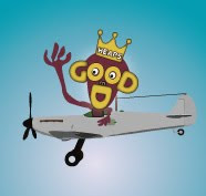
Wow.. I just realised how much my monkey in logo looks like Tony bloody Abbott... That's quite disturbing! Hopefully no one will remember who he is in the not-too-distant future..

Monday, July 19, 2010
My Logo!
Here's my logo for Heaps Good Design..

It is a carry-over from last semester & I look forward to working on it a bit more & animating it soon.

It is a carry-over from last semester & I look forward to working on it a bit more & animating it soon.
Check Magazine - homepage redesign
My redesign of the Check Magazine homepage:

Design feedback from Elizabeth:
Need to:

Design feedback from Elizabeth:
- likes black seperator bars - noted how they compliment the models belt & tie
- likes the typography used - works well with fashion & lifestyle magazine
- complimented the text box in main image & gradient used - clean & classy
- commented on good use of colour - repetition of balck & whites as well as red & yellow
Need to:
- links need to be added to text paragraphs
- the plus symbol needs to be added adjacent to main image text box
- consider overall size of homepage - make sure its acceptable
Thursday, June 17, 2010
Creating Client Website... 3rd draft of webpage
Ok .. the blog entries may be a little out of order..
You should have a view of my classmate feedback of my 2nd draft webpage design. Overall they thought it was visually appealing and captured the spirit of my client's company well. I did get some very useful feedback about the white content boxes feling a little to harsh and not blending into the design enough.
Below is my further update in light of that feedback..

I also like the hand now holding the whole webpage - kind of cheeky play on the navbar and also reinforces the home/ community made aspect which is at the heart of the company.
I've shown the design to Naomi and she's stoked with it.. reckons it has really come together!
I've created a few little Flash animations too that are tricky to show you here..
Well it's time now for me to start working from this base and creating the other webpages.
I'm so glad Naomi really likes what we have come up with together - I say together because it definitely feels like it has been a very collaborative process.. It's been up to me to actually make the visuals but what they consist of has been an ongoing organic process as we've bounced ideas off each other. It's been an opportune way to work and I know not all clients will want to work with such regular spontaneous contact but that's suited Naomi. Regardless, I have definitely learned that listening hard, reading for deeper meaning, being perceptive and identifying motifs that visually convey the emotions of the clients company and the work they do has been invaluable in coming up with a design the client is really happy with - I'm sure that would go for any client!
Well that's enoght for now.. I've got a heap of work to do so see you in a bit as I roll up the sleeves and churn it out!
You should have a view of my classmate feedback of my 2nd draft webpage design. Overall they thought it was visually appealing and captured the spirit of my client's company well. I did get some very useful feedback about the white content boxes feling a little to harsh and not blending into the design enough.
Below is my further update in light of that feedback..

I also like the hand now holding the whole webpage - kind of cheeky play on the navbar and also reinforces the home/ community made aspect which is at the heart of the company.
I've shown the design to Naomi and she's stoked with it.. reckons it has really come together!
I've created a few little Flash animations too that are tricky to show you here..
Well it's time now for me to start working from this base and creating the other webpages.
I'm so glad Naomi really likes what we have come up with together - I say together because it definitely feels like it has been a very collaborative process.. It's been up to me to actually make the visuals but what they consist of has been an ongoing organic process as we've bounced ideas off each other. It's been an opportune way to work and I know not all clients will want to work with such regular spontaneous contact but that's suited Naomi. Regardless, I have definitely learned that listening hard, reading for deeper meaning, being perceptive and identifying motifs that visually convey the emotions of the clients company and the work they do has been invaluable in coming up with a design the client is really happy with - I'm sure that would go for any client!
Well that's enoght for now.. I've got a heap of work to do so see you in a bit as I roll up the sleeves and churn it out!
Creating Client Website... 2nd draft webpage layout
and here's the update..
Taking into account all the things Naomi fed back to me.. here is my 2nd draft of the webpage design.
This is the one I will be presenting in class tomorrow..

As you can see: a blue background, redesigned logo & almost completed navbar (oops just realised I forgot to change BIOS to TEAM - doh!)..
Next post will be when I show it in class for peer feedback!
Taking into account all the things Naomi fed back to me.. here is my 2nd draft of the webpage design.
This is the one I will be presenting in class tomorrow..

As you can see: a blue background, redesigned logo & almost completed navbar (oops just realised I forgot to change BIOS to TEAM - doh!)..
Next post will be when I show it in class for peer feedback!
Creating Client Website... 1st webpage mockup
Here's some detail of my 1st webpage mock up highlighting logo, navbar & background colour..

Naomi's verdict -
Navbar: really really loves the navbar.. thinks it captures the comapny really well... just told me when adding further buttons & people - try to get a good diversity of cultures in there if possible. Also we both decided the term TEAM would be better than BIOS (biographies of company staff).
Logo: likes colours, themes - just reckons the characters look a little too close to golliwogs and that's not too good for a company that works with Indigenous people! I told her it wasn't intentional - I was tryig to go for simplicity & that they were meant to be silhouettes... It's mainly due to my limitations as an illustrator to be able to create simplistic detail but I will definitely have another crack at it for sure!
Background colour - since mocking this up - I've been thinking how much the background would be better opting for a shade of blue... Naomi was keen on eathern tones like deep red soil, but I reckon I've managed to get that tone in there in alot of graphic stuff I came up with and that we really need a background that is goin to make that visual content stand out... Naomi completely agreed and all is going really well I feel.

Naomi's verdict -
Navbar: really really loves the navbar.. thinks it captures the comapny really well... just told me when adding further buttons & people - try to get a good diversity of cultures in there if possible. Also we both decided the term TEAM would be better than BIOS (biographies of company staff).
Logo: likes colours, themes - just reckons the characters look a little too close to golliwogs and that's not too good for a company that works with Indigenous people! I told her it wasn't intentional - I was tryig to go for simplicity & that they were meant to be silhouettes... It's mainly due to my limitations as an illustrator to be able to create simplistic detail but I will definitely have another crack at it for sure!
Background colour - since mocking this up - I've been thinking how much the background would be better opting for a shade of blue... Naomi was keen on eathern tones like deep red soil, but I reckon I've managed to get that tone in there in alot of graphic stuff I came up with and that we really need a background that is goin to make that visual content stand out... Naomi completely agreed and all is going really well I feel.
Creating Client Website.. Graphic Elements & Logo
Naomi sounded pretty pleased with my visual ideas & I thought it would be great to get these properly mocked up in Illustrator so I can include them in proposal & also .. I really need some visual materials to help me be able to create the visual design for the website!!
Here's a few more sketches..
 And now it's time to reveal some of my hard toil in Illustrator..
Below is a complete page from the proposal showing off the logo design and a motherload of other graphic elements - based on ongoing discussions with Naomi about what needs to be in the website and what it should look like. Check this out...

Here's a few more sketches..

Below is a complete page from the proposal showing off the logo design and a motherload of other graphic elements - based on ongoing discussions with Naomi about what needs to be in the website and what it should look like. Check this out...

Subscribe to:
Posts (Atom)