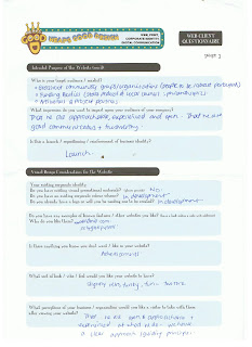
Prior to our meeting, I asked Naomi to fill out a questionnaire to help us both draw focus on what she was wanting out of a website, what it should look like, feel like and what it should contain, as well what in her mind was the optimal way of working together on it.
Check out the scanned questionnaire forms below:


I'm going to need to sit down and have another good read over them & start sketching out some notes & ideas..
But before I go, here's a quick off-the-cuff list of observations about the job:
- Two Thumbs Up is a newly formed company that is looking to launch itself into the marketplace - the website will likely be the central feature of this launch (yeah! and yikes!)
- Two Thumbs Up is a brand new company that hasn't created any work of its own yet, so pre-existing materials for website (eg photos, other promo materials etc) are scarce - that means it will most likely be necessary for me to create a number of graphics / illustrations (including a company logo) to supplement written website content on the website.
- From talking with Naomi, the two most unique marketing points that make Two Thumbs Up stand out from the crowd are: 1. the company's personality / unique identity and 2. their unique process (the way they go about their work). Thus the website will have to resonate these 2 key aspects loud & clear.
But for now...goodnight!


No comments:
Post a Comment